What is Graphic Translation?
Best described by the author Kimberly Elam – writer, educator and graphic designer who wrote the book on Graphic Translation “Graphic Translation: A Graphic Design Project Guide” as “The process of graphic translation produces drawings of instant recognition and startling visual interest. Graphic translation focuses on the creation of an image with the visual means of abstraction, reduction, and interpretation with points, lines, shades, and shadows.”
Overview
Client
The Royal Ontario Museum
Art In a Gemstone Gala gallery event
Exhibit date: November 2019 – March 2020
The Royal Ontario Museum
Art In a Gemstone Gala gallery event
Exhibit date: November 2019 – March 2020
The event is in honour of Daniel Libeskind a Polish-American architect who designed the new extension of the Royal Ontario Museum (ROM) in 2007, now named the Michael Lee-Chin Crystal.
Objectives
The creative purpose of the simplified visual element is to use it as a primary design theme for the campaign and to be adaptable across different platforms to promote the gala.
Technical Objective
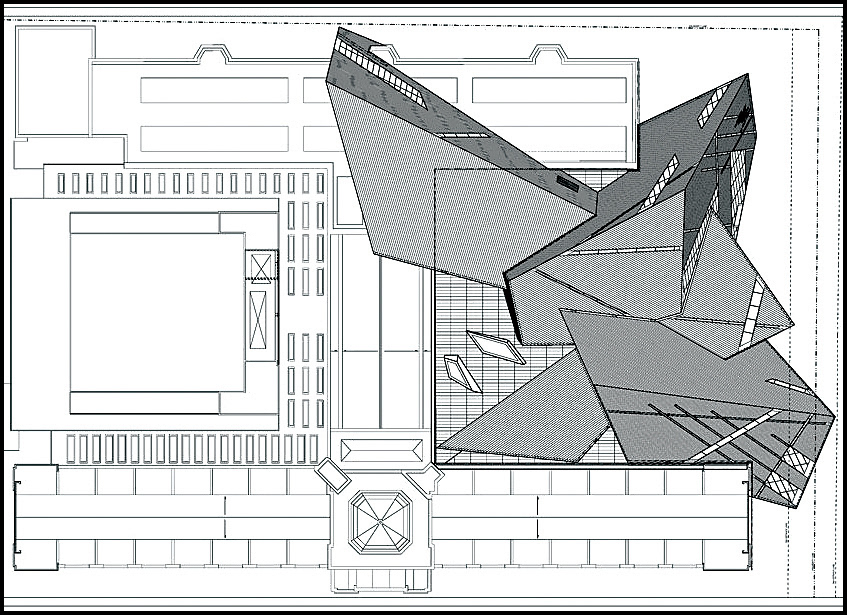
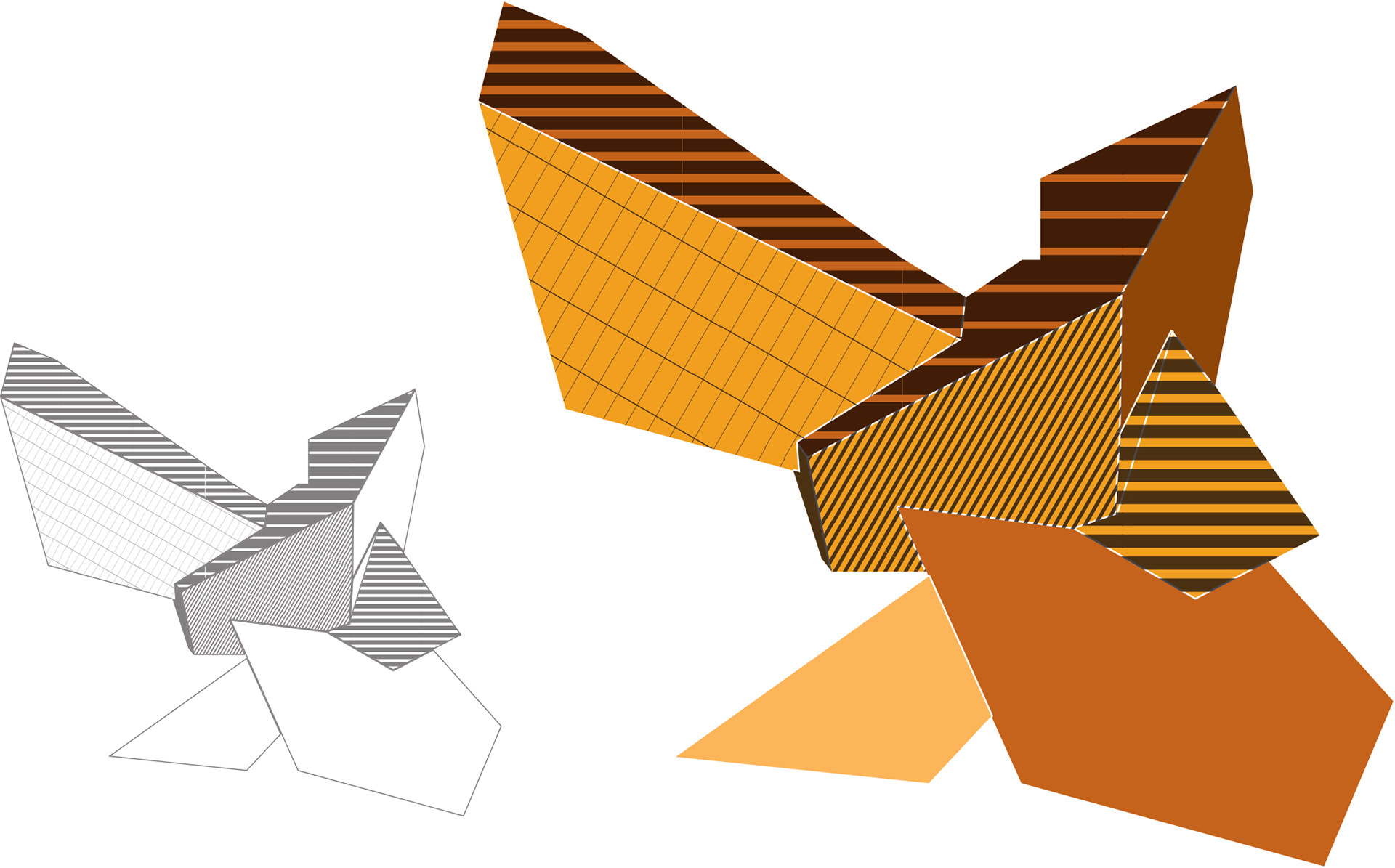
To use the Graphic Translation technique to deconstruct the complex essence of the Michael Lee-Chin Crystal building, transitioning its shape to its simplest form, creating a geometrical design shape taken from the building.
To use the Graphic Translation technique to deconstruct the complex essence of the Michael Lee-Chin Crystal building, transitioning its shape to its simplest form, creating a geometrical design shape taken from the building.
Design Objectives
Whether the visual element is used solely or combined with other components, it is essential for the design to stay consistent and cohesive throughout and for the visual element to stay prominently recognizable.
Whether the visual element is used solely or combined with other components, it is essential for the design to stay consistent and cohesive throughout and for the visual element to stay prominently recognizable.
Poster Design
Inspired by the Art Deco movements, shapes and colours, I combined the visual element with Daniel’s photograph to create a complex design structure, as shown in the poster.
Inspired by the Art Deco movements, shapes and colours, I combined the visual element with Daniel’s photograph to create a complex design structure, as shown in the poster.
Blending the two creates engaging and conspicuous arrangements that artistically merge Art Deco and a hint of Abstract movements in a single composition.
My design thinking approach for this project symbolizes a strong belief in social and technological expansion and the development of civilization.
My design thinking approach for this project symbolizes a strong belief in social and technological expansion and the development of civilization.
The design process
DID YOU KNOW?
The initial concept was inspired by the ROM’s gem and mineral collections, giving it the title of “crystal” because of its crystalline shapes.
*Image credit: Studio Daniel Libeskind
Visual Elements Extractions
After using the Graphic Translation technique, I created four different colour
shades of the crystal drawing.
shades of the crystal drawing.
The combinations
Blending the crystal shape with architect Daniel Libeskind's photo to create the design.

Poster Design
The combination of the Crystal visual element and Daniel’s photograph creates complex, engaging and conspicuous design that artistically merge Art Deco and a hint of Abstract movements in a single composition.
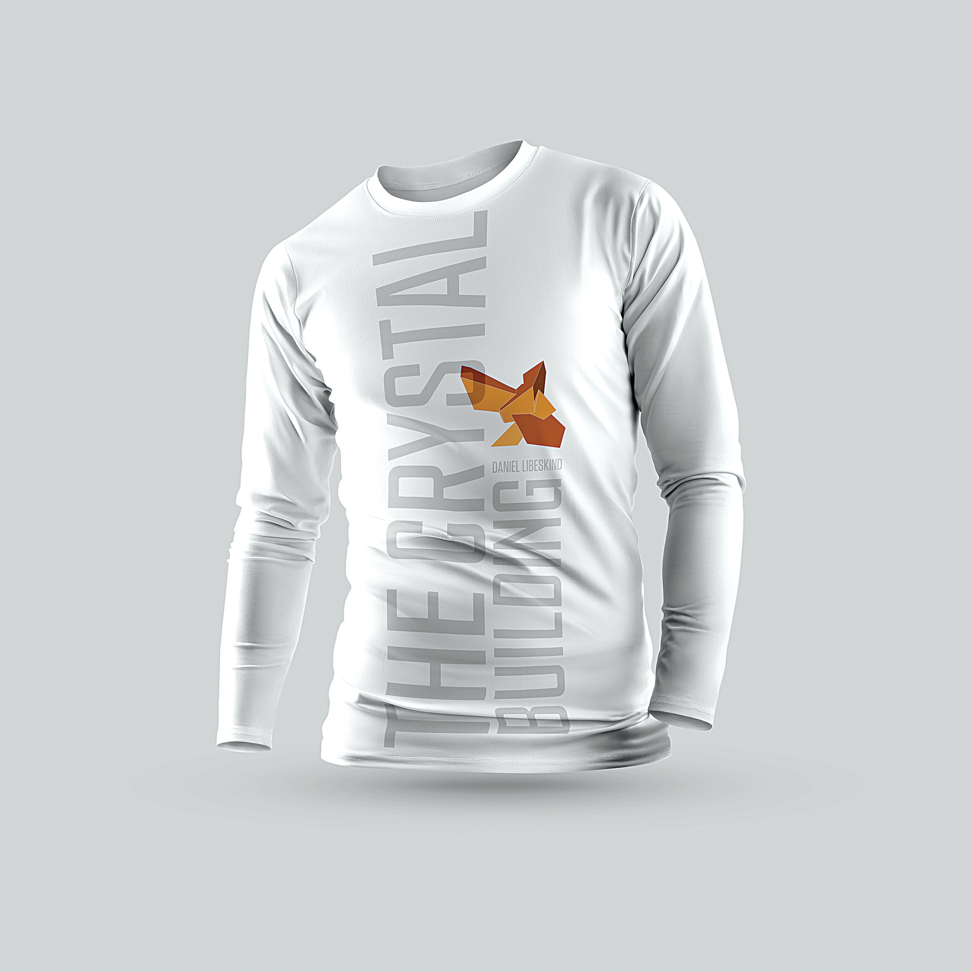
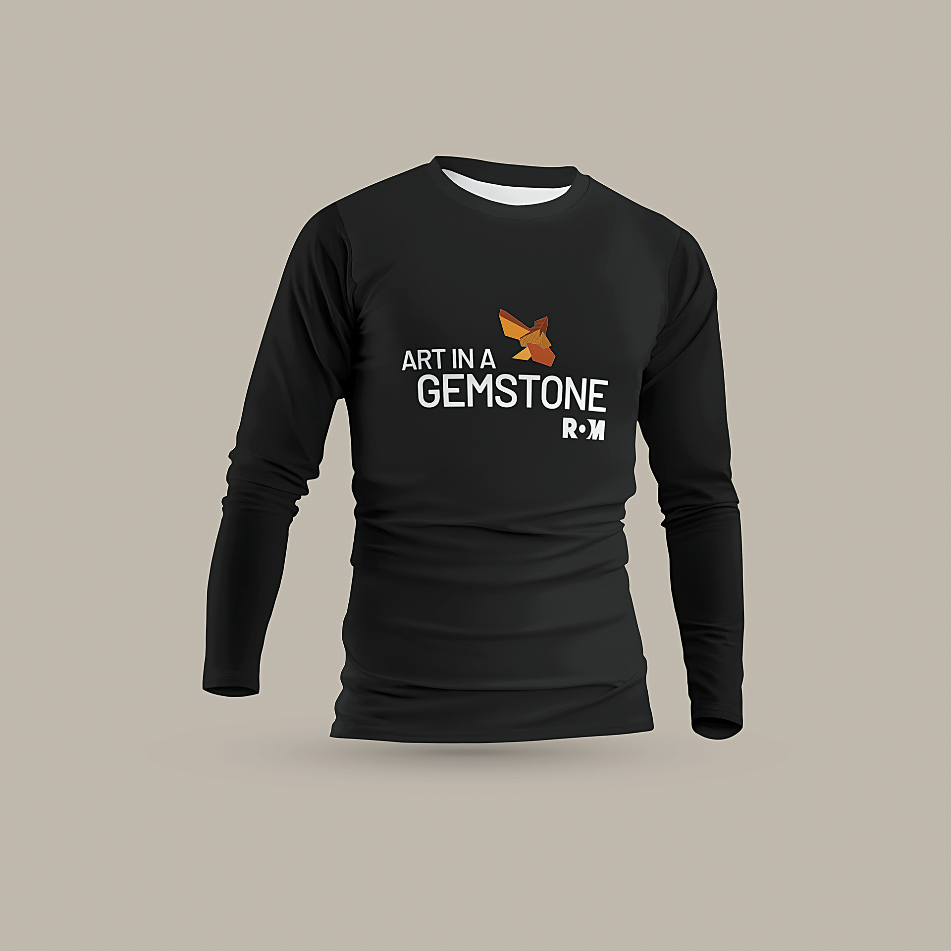
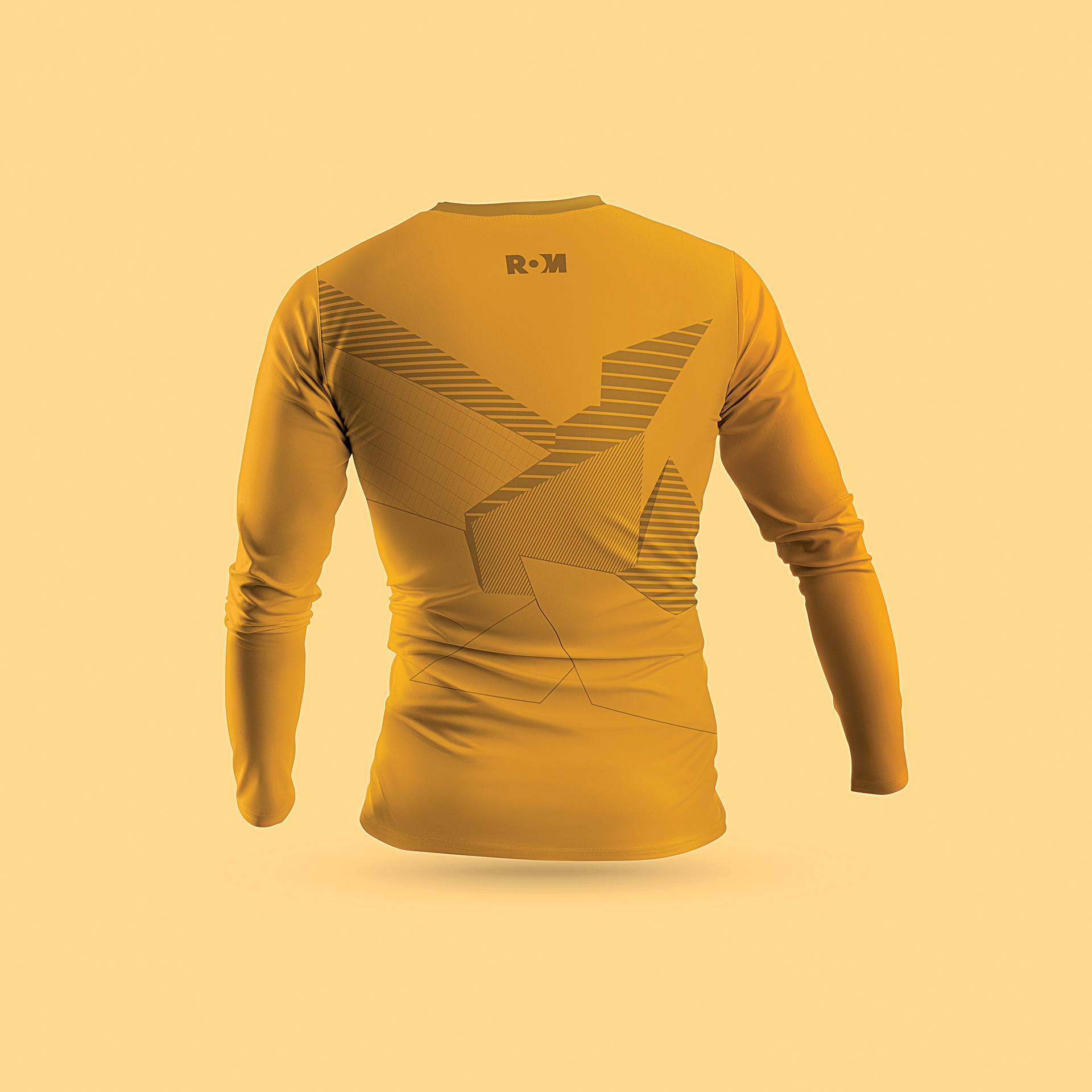
Gala gift shop items
