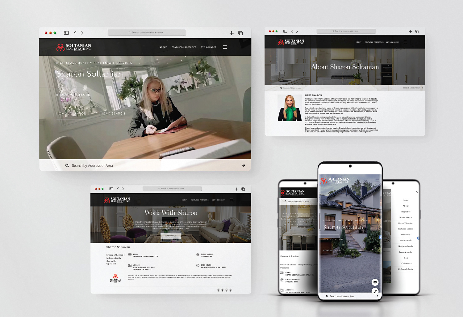
meet Sharon
Industry innovator Sharon Soltanian has been the Broker of Record for over 18 years. She describes her real estate firm as a high-class quality service selling for North York Ontario luxury market.
Industry innovator Sharon Soltanian has been the Broker of Record for over 18 years. She describes her real estate firm as a high-class quality service selling for North York Ontario luxury market.
In 2014, Soltanian hired me to design a new logo and create a complete branding package for her company with a solid vision in mind.
When I first met Sharon, her initial idea helped me immensely; however, as I got to know her more over two weeks working on her project, her inspiring personality, charisma, and elegant presence impacted my design thinking process and put me in the right direction.
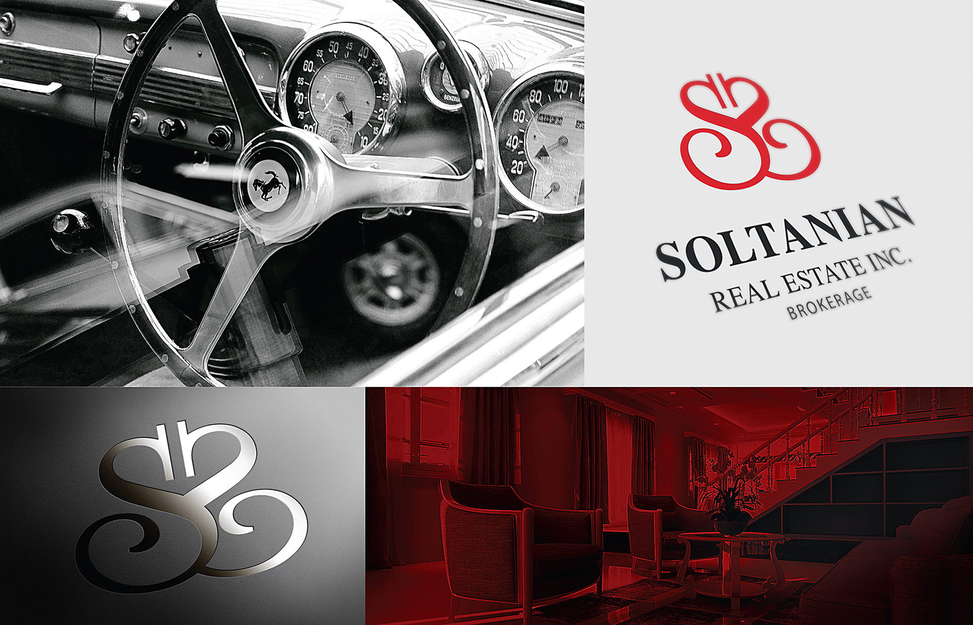
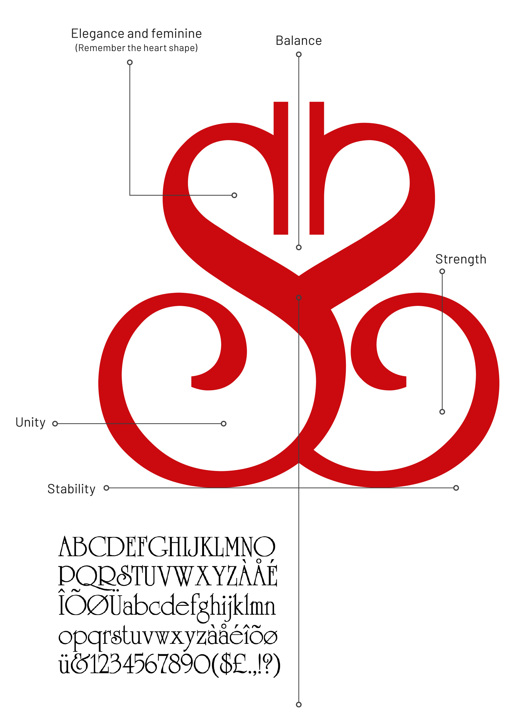
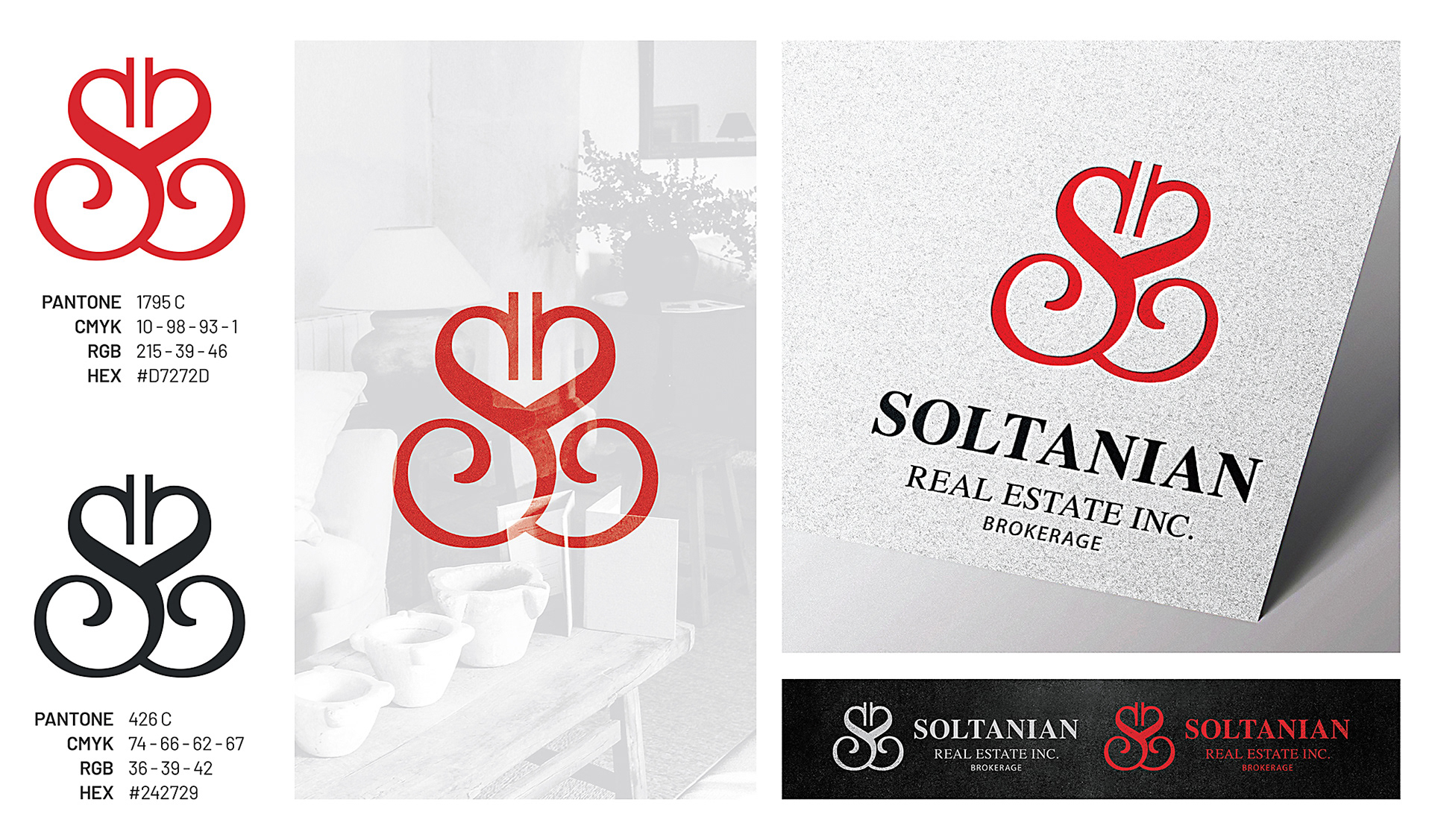
She asked me to utilize her initials (SS) as the central theme for the logo, creating a luxurious and feminine charm—a perfect impression of her character and the type of clientele she serves.
Objective
I divided Sharon’s project into two objective categories; business and personal.
I divided Sharon’s project into two objective categories; business and personal.
BUSINESS OBJECTIVES
To establish a brand identity that creates cohesiveness across multiple platforms. To reflect a professional and luxurious real estate business as she has grown successfully over the years. To stand out more as competitions have overgrown. Influence and build trust with new clients.
To establish a brand identity that creates cohesiveness across multiple platforms. To reflect a professional and luxurious real estate business as she has grown successfully over the years. To stand out more as competitions have overgrown. Influence and build trust with new clients.
PERSONAL OBJECTIVES
Impressionable. Unique elegance. Personal professionalism. Memorable. Recognizable and consistent through a transitional phase to reconnect with existing clients and invite new ones.
Impressionable. Unique elegance. Personal professionalism. Memorable. Recognizable and consistent through a transitional phase to reconnect with existing clients and invite new ones.
Achievement
Using University Roman was an excellent choice of a typeface to work with for the logomark. The font is notable for its narrow capitals with crossbars that sit well above the median line. This typeface evokes a romantic and feminine feel.
Using University Roman was an excellent choice of a typeface to work with for the logomark. The font is notable for its narrow capitals with crossbars that sit well above the median line. This typeface evokes a romantic and feminine feel.
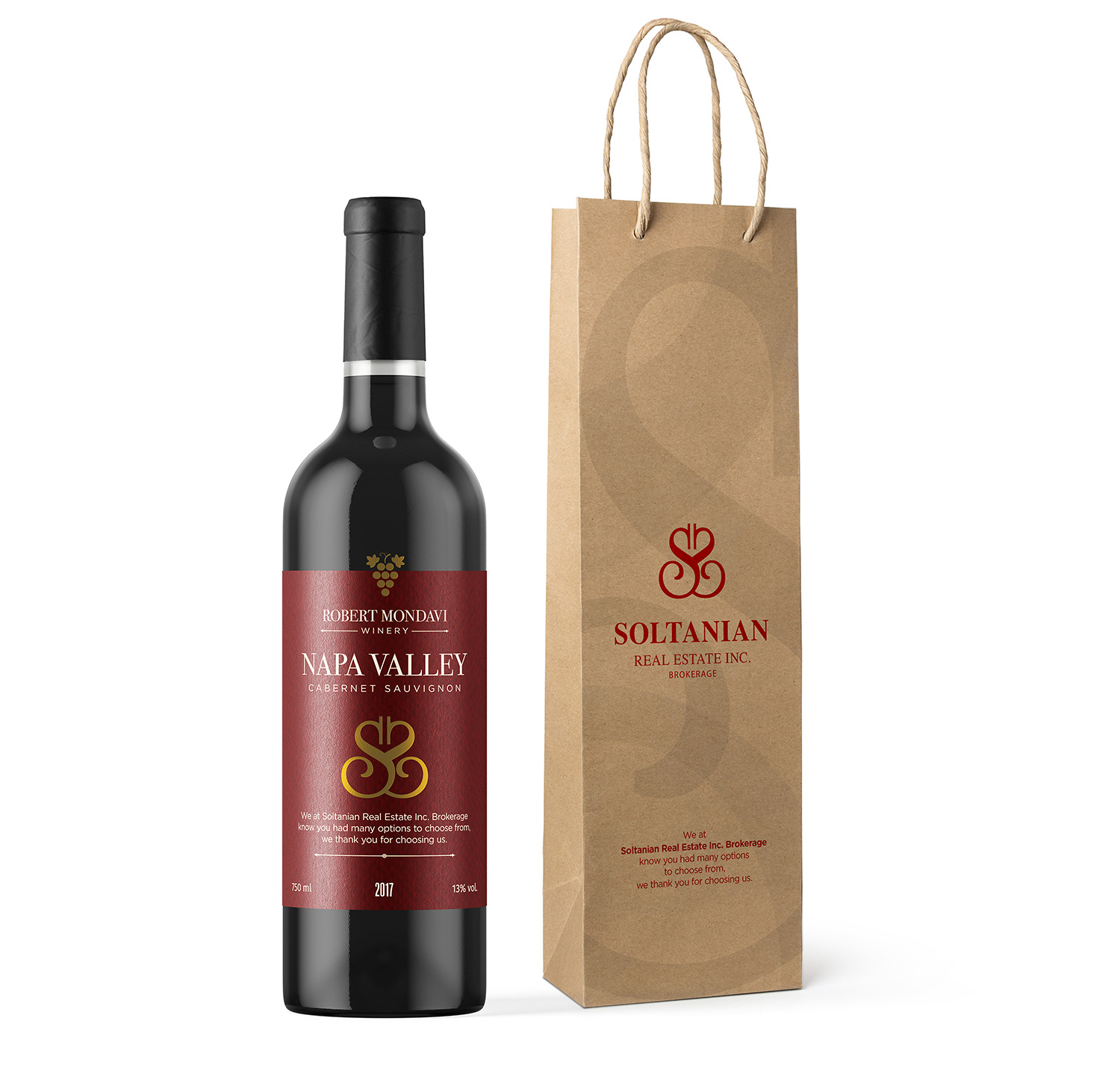
wine label design
A classy way to say thank you to a client.
A classy way to say thank you to a client.
business Stationery
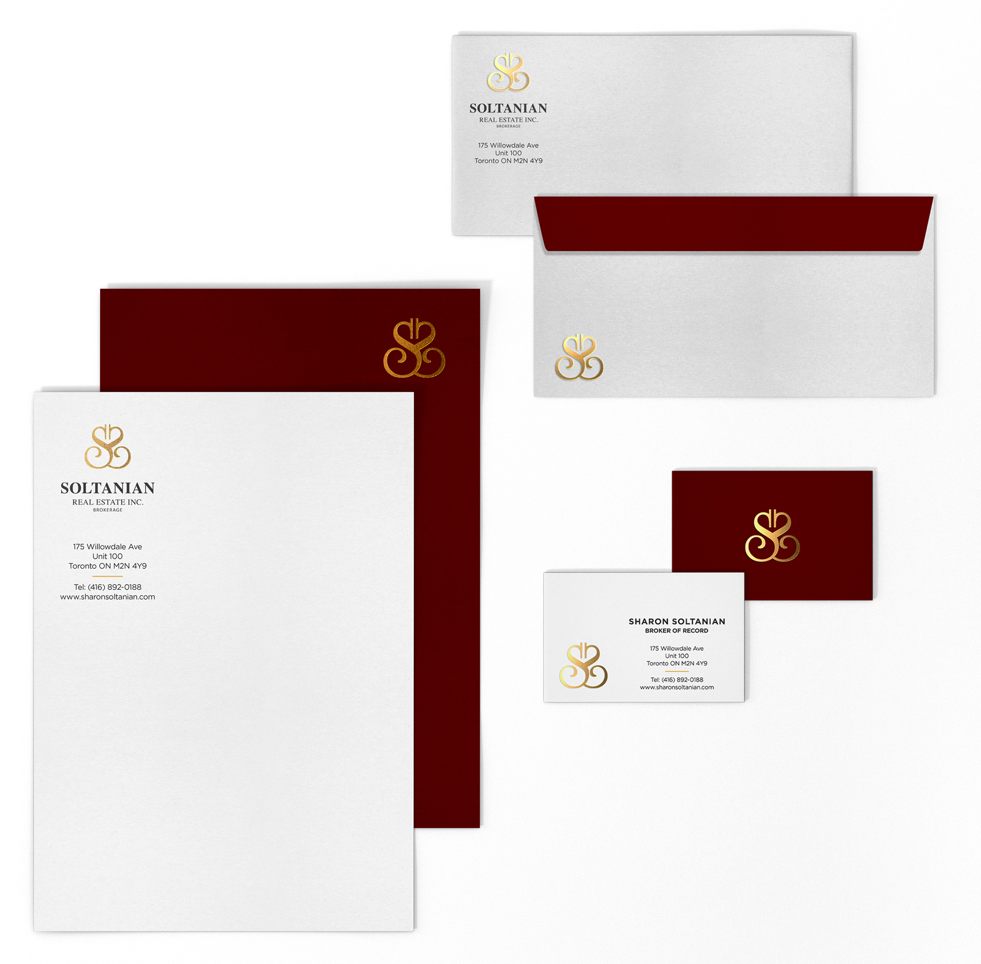
Soltanian Real Estate Inc. Brokerage
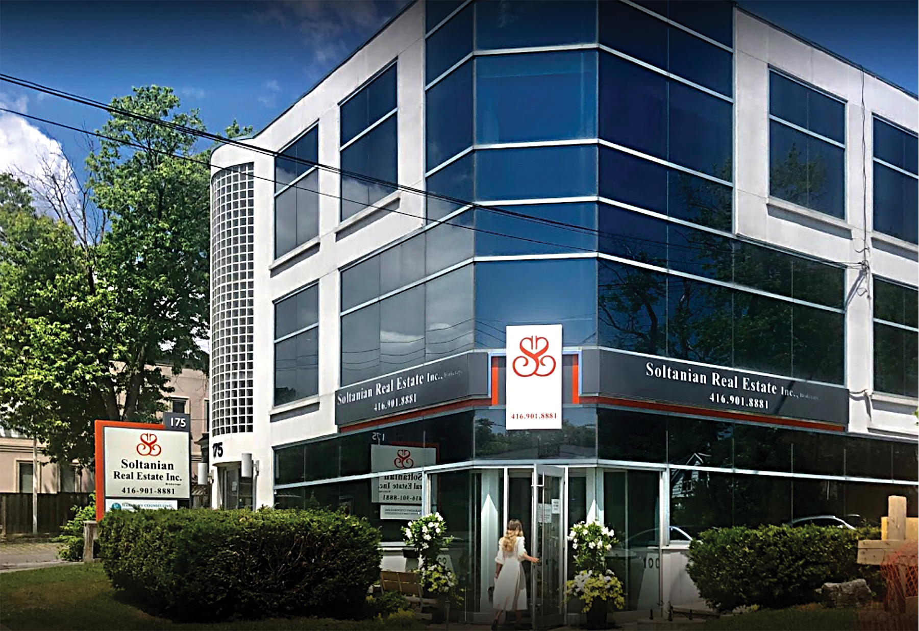
exterior Office building
175 Willowdale Ave, Toronto, ON M2N 4Y9
exterior Office building
175 Willowdale Ave, Toronto, ON M2N 4Y9
Soltanian Real Estate Inc. Brokerage
interior Office
175 Willowdale Ave, Toronto, ON M2N 4Y9
interior Office
175 Willowdale Ave, Toronto, ON M2N 4Y9