about Nick & Zina
Nick and Zina are real estate brokers and staging company based in Burlington, ON. They serve Burlington, Oakville, Mississauga and Toronto areas.
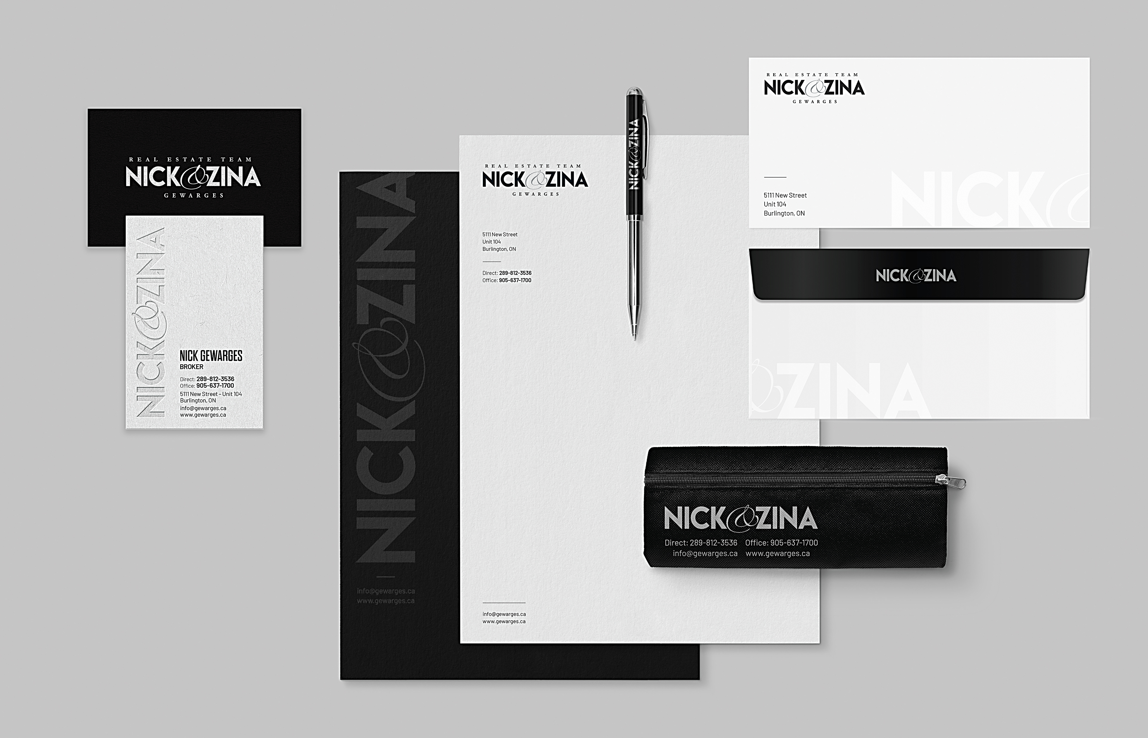
Problem and Solution
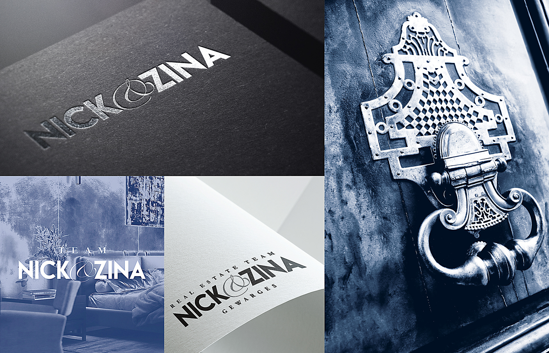
When I first met with Nick and Zina, they addressed and shared some issues with their old logo. First, it was created by an inexperienced designer, so it was designed incorrectly. They wanted to make sure it was professionally redesigned to stay consistent throughout their marketing and advertisements.
As you can see, they use their names for a logotype. The case with the previous logo had enormous space (as we call it kerning) between each character, which created an awkward type treatment for their logo, making it challenging to read their names. I also noticed improper alignment that was overlooked, which I addressed. The second issue, it was difficult for them to stay consistent through their marketing.
Objective
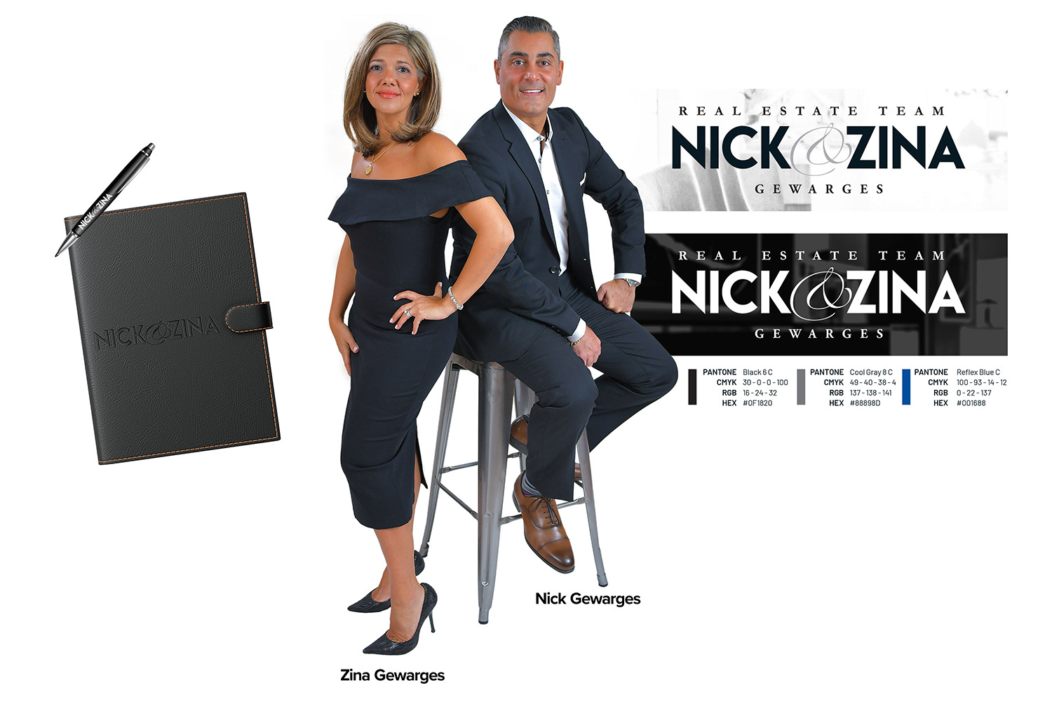
The main objective for Nick & Zina was to have a sustainable and professionally designed logo that would be cohesive throughout their marketing. Also, a modern and distinctive logotype that implies their strong business values.
The main objective for Nick & Zina was to have a sustainable and professionally designed logo that would be cohesive throughout their marketing. Also, a modern and distinctive logotype that implies their strong business values.
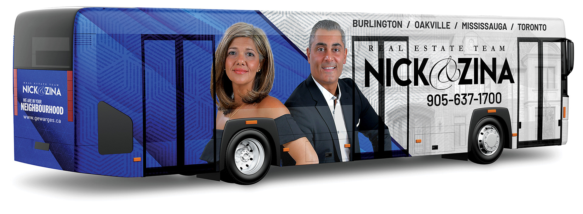
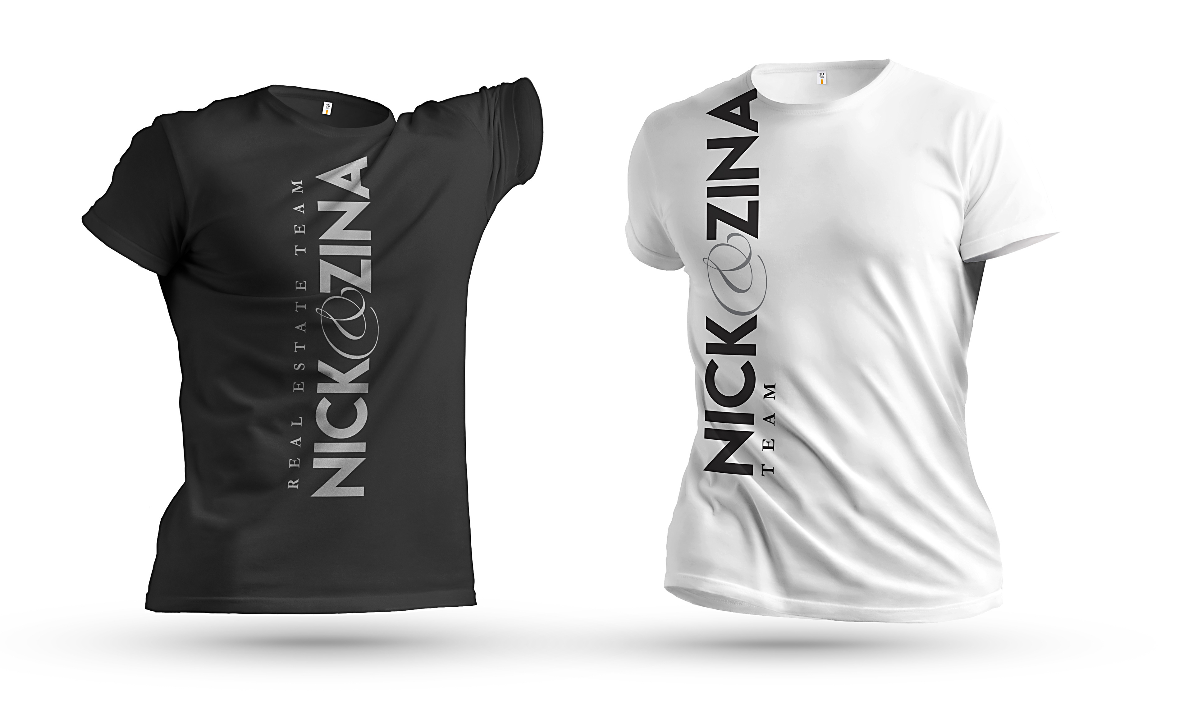
I decided to use a bold and strong typeface that is legible and functional across many platforms such as bus stops, publications, advertisements and social media.
Achievements
For nearly three years, I have been working collaboratively with Nick and Zina, assisting with their marketing and advertisements, establishing and improving their business strategy, making them a well-known real estate company, especially in Burlington, Ontario, and across Greater Toronto Area.
For nearly three years, I have been working collaboratively with Nick and Zina, assisting with their marketing and advertisements, establishing and improving their business strategy, making them a well-known real estate company, especially in Burlington, Ontario, and across Greater Toronto Area.
The wheels on the bus go round and round,
and so do Nick & Zina
and so do Nick & Zina